


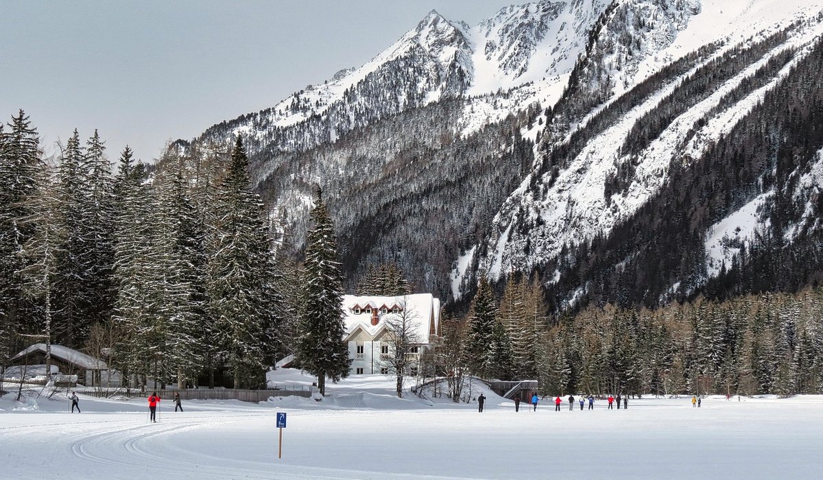
Why natural colour is worth the effort
There is a quiet magic in a Scottish glen at first light, or a Norwegian fjord under a pale winter sky, that no preset can invent. The colours are often subtle: mossy greens, peat-stained water, lichen grey, the soft lilac of distant hills. When you edit landscape photos from these places, your goal is not to make them shout. It is to bring the viewer back to what you felt standing there, boots muddy and hands cold, watching the light change. Natural colour editing is about restraint. It is about knowing which sliders to move, which to leave alone, and when to walk away from the screen.
Get exposure right before you touch colour
Colour problems are often exposure problems in disguise. If your highlights are blown, the sky turns white and the subtle blues and pinks are gone forever. If shadows are crushed, the texture in dark rocks and forest floors becomes a noisy mess. Start every edit by checking the histogram, not just the image preview. For UK and Scandinavian scenes, bright overcast skies and dark coniferous forests create a huge dynamic range. Expose for the highlights, then lift shadows gently in editing. Pulling shadows too far creates flat, grey results and visible noise.
- Protect the highlights: In bright coastal or mountain scenes, underexpose slightly rather than clipping the sky.
- Use the histogram: Aim for data that just touches the right edge, not a spike against it.
- Recover with care: Shadow sliders are powerful, but stop before textures look plastic or muddy.
- Shoot RAW: It gives you far more room to adjust exposure without breaking colour.
White balance: the quiet foundation
White balance is the single most important colour decision you make. Get it wrong and everything else feels off. In the UK, overcast days often add a cool blue cast, while deep woodland can push greens in strange directions. In Scandinavia, winter light can be intensely blue, and summer evenings may stay warm for hours. Use a grey card or a neutral reference if you have one. Otherwise, look for something that should be neutral in the scene, such as a grey rock or a white birch trunk. Then adjust temperature and tint slowly. A slightly cool white balance can feel right for a frosty morning, but too cool makes skin tones and autumn leaves look dead.
- Overcast UK days: Warm the image a touch, but keep the soft, diffuse feel.
- Nordic winter: Embrace the blue, but avoid making snow look like a swimming pool.
- Golden hour: Resist the urge to add orange. The light already did that work.
Contrast that respects the landscape
Contrast is where many edits go wrong. A heavy hand with global contrast, clarity, and dehaze can turn a gentle Lake District valley into a crunchy, haloed mess. Instead, think in layers. Use a gentle S-curve to add depth, then apply local contrast only where it helps: the texture of slate, the ripples on a loch, the bark of a pine. Avoid pushing clarity across the whole image. Skies and water often need less, not more. If you see dark halos around tree branches or along ridgelines, you have gone too far.
- Start gentle: A small contrast boost is usually enough in flat northern light.
- Use masks: Apply contrast to foreground rocks or midground trees, not the sky.
- Watch for halos: Zoom in to check edges where dark meets light.
- Embrace softness: Mist, rain, and haze are part of the landscape, not errors to fix.
Colour grading without going overboard
Once exposure, white balance, and contrast are settled, you can refine individual colours. This is where heather purples, autumn birches, moss greens, and fjord blues come alive. Use HSL tools or selective colour adjustments, but keep changes small. A common mistake is to saturate every colour equally, which makes the image look like a postcard from a petrol station. Instead, decide on one or two colours to lift. Maybe the warm gold of a birch canopy against a cool blue sky. Maybe the deep rust of bracken on a Yorkshire moor. Reduce saturation elsewhere if needed. Vibrance is often safer than saturation because it protects already bright colours.
- Lift one or two colours: Let the rest stay quiet.
- Adjust luminance: Darkening a blue sky can add drama without extra saturation.
- Check for colour casts: Greens can creep into shadows; neutrals should stay neutral.
- Step away: Your eyes adapt. A five-minute break reveals oversaturation fast.
A simple finishing check for natural results
Before you export, run through a short checklist. Look at the image at full size, then at thumbnail size. Does it still look like the place you visited? Compare it mentally to your memory, not to a trending edit. Check the histogram again: are you clipping highlights or shadows unnecessarily? Look at the whites and blacks. In a natural landscape, the brightest white might be a cloud or a snow patch, and the darkest black might be a shadow under a rock, but rarely pure white or pure black. Finally, ask yourself if the colours feel believable. If a Norwegian fjord looks like a tropical lagoon, or a Scottish moor looks like a neon autumn, you have gone too far. Natural colour editing is a skill of subtraction as much as addition. The best compliment is not “great edit” but “that looks just like it felt.”


Leave a reply